Digital humanists with an interest in environment 🍃
We are 6 UCLA students brought together by our interest in data and its story-telling abilities, and the story we chose to investigate was walkability — living in a walkable college town made us realize how crucial it was to our livelihoods, thus we wanted to take a deeper dive.
We set our interest to investigate what truly makes a walkable city successful, and how the narratives we create regarding walkability could impact governments to make a bigger push towards human-centered urban planning. We also wished to explore what demographics of people are more or less likely to have access to higher quality of life through walkable communities, and if there are any patterns or systemic barriers to such access.
What steps does a Digital Humanities project entail? 📐
Source Selection
To investigate walkability and its associations with other factors, our team chose to work with the Nationality Walkability Index and Smart Location Database (SLD). In 2014, the SLD was released and recorded 106 variables ranging from Area, Demographics, and Employment, to Density, Diversity, Design, Transit, and Destination Accessibility. In 2021, the National Walkability Index was released as a byproduct of SLD by calculating a National Walkability Score across the US using four variables of the SLD (intersection density, proximity to transit stops employment mix, and employment and household mix); thus in essence, the two are extremely similar with the National Walkability Index having one additional walkability score.
Since the National Walkability Score is only based on four variables, we wished further to explore its connections with other variables in the SLD, thus we employed several measures previously unrelated in the calculation process of the score. The SLD is recorded in units of Consensus Data Groups (CBG), the smallest geographical unit for which the bureau publishes sample data. With all 50 states and the other USA territories, a total of 220,740 CBGs made up the enormous databases we worked with.
Although extensive, the SLD was still missing a few factors wished to explore, such as mental health, BMI index, green space measures, etc. After confirming the additional topics needed, each member researched for supplemental empirical research and articles; then, we reconvened to look for a consistent narrative and decided on the emphasis of factors in our representation.
Data Processing
The Environmental Protection Agency (EPA) provided a mostly clean data set that had minimum missing and null values. Although they were mostly not of interest to our research questions, we completed some further cleaning with Excel for data involving cities on the state borders or when creating visualizations with an emphasis on California regions. We employed Tableau as our main method of data visualization since it required minimal CS experience and was still capable of providing interactive and comprehensive results — although all of the members here have been previously unfamiliar with the software, we gained experience in class and showcased such skill through the graphs we’ve created for this project. When further data manipulation was required to extract additional information from the data, we used other software such as R and Python sparingly due to the more customization, faster running ability, and stronger statistical analysis power they had. Each visualization was created to best represent the narratives being told, while we kept in mind the structure of the variables to select the best type of visualization.
Narrative Presentation
Our team created this website using WordPress and hosted it through UCLA’s HumSpace Portal, a website hosting service aimed to assist UCLA students and faculties in the humanities department. We landed on the decision because of the creative capacity and abundant functionality from third-party plugins that were available to use through WordPress when the majority of us had no experience with website designing. As a website-building platform, WordPress is maturely developed and provides numerous features in organized formats (such as themes, block-design systems, easy typography adjustments, various device previews, etc) all through a beginner-friendly user interface. With the assistance of the UCLA Disabilities and Computing Program, our team understood the necessary elements to make web designs accessible to all, thus we made sure to use accessible color palettes and hierarchical typography for easier legibility and reduced cognitive load across devices and platforms.
Since WordPress was extremely versatile when it came to linking external functions using “shortcodes” or HTML codes, we were able to take advantage of several third-party functions as well as their in-house plug-ins. For example, we employed the plugin Ultimate Blocks to create the dropdown annotated bibliographies. We also used Timeline.js to present our timeline and bring the historical factors of walkability in California throughout the years along with major events that could’ve conflicted such scores into life. The extension tool was beginner-friendly for our website designers, and we successfully visualized historical data with images and interactive features to foster an engaging user experience for viewers.
When deciding on the visualization formats for the findings we have discovered in our datasets, we heavily referenced the website “Which chart or graph is right for you?” (Hardin et al.) and decided on the types of graphs to employ for different types of data; then, we published such visualizations to Tableau Public and utilized their respective HTML code to present our graphs with interactive features such that viewers could view multiple measures within each data visualization and clarify our team’s thought process for the conclusion with visualized evidence.
Lastly, our vision for the website’s aesthetic was also considered through factors including color palette, typography, and symbolic representations for specific topics. In terms of color, we landed on an overall neutral palette of black, white, and gray for the hierarchical texts, and we occasionally used teal for certain small elements as it is gender-neutral, associates well with nature and walkability, and provided pops of color every so often. As our investigation could get data-heavy and complicated, eligibility and minimal cognitive load when reading the content are extremely important for our readers, thus we employed a simple yet classic sans serif font family. Lastly, to efficiently convey content and express our narratives, we often used symbolic visual elements, whether it be the walking montage on our landing page or emojis found next to titles or key points throughout the website. Not only did those design elements aid the website aesthetics to match our research, but they also ensured user-friendliness and accessibility for all.
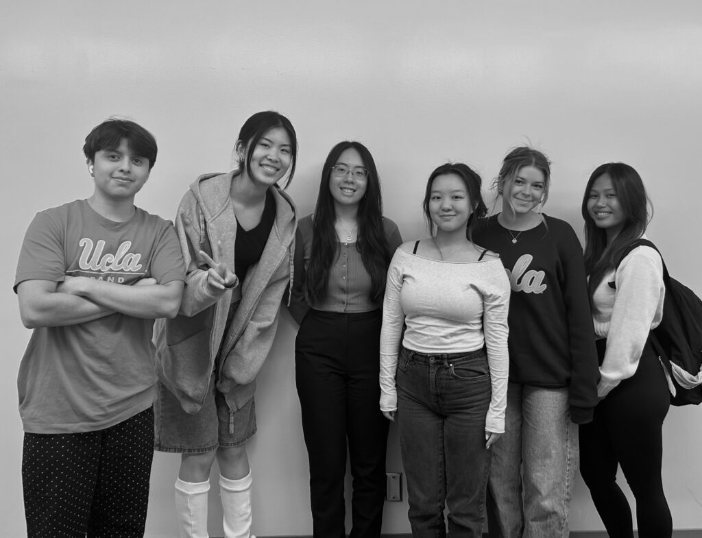
Our team 👪

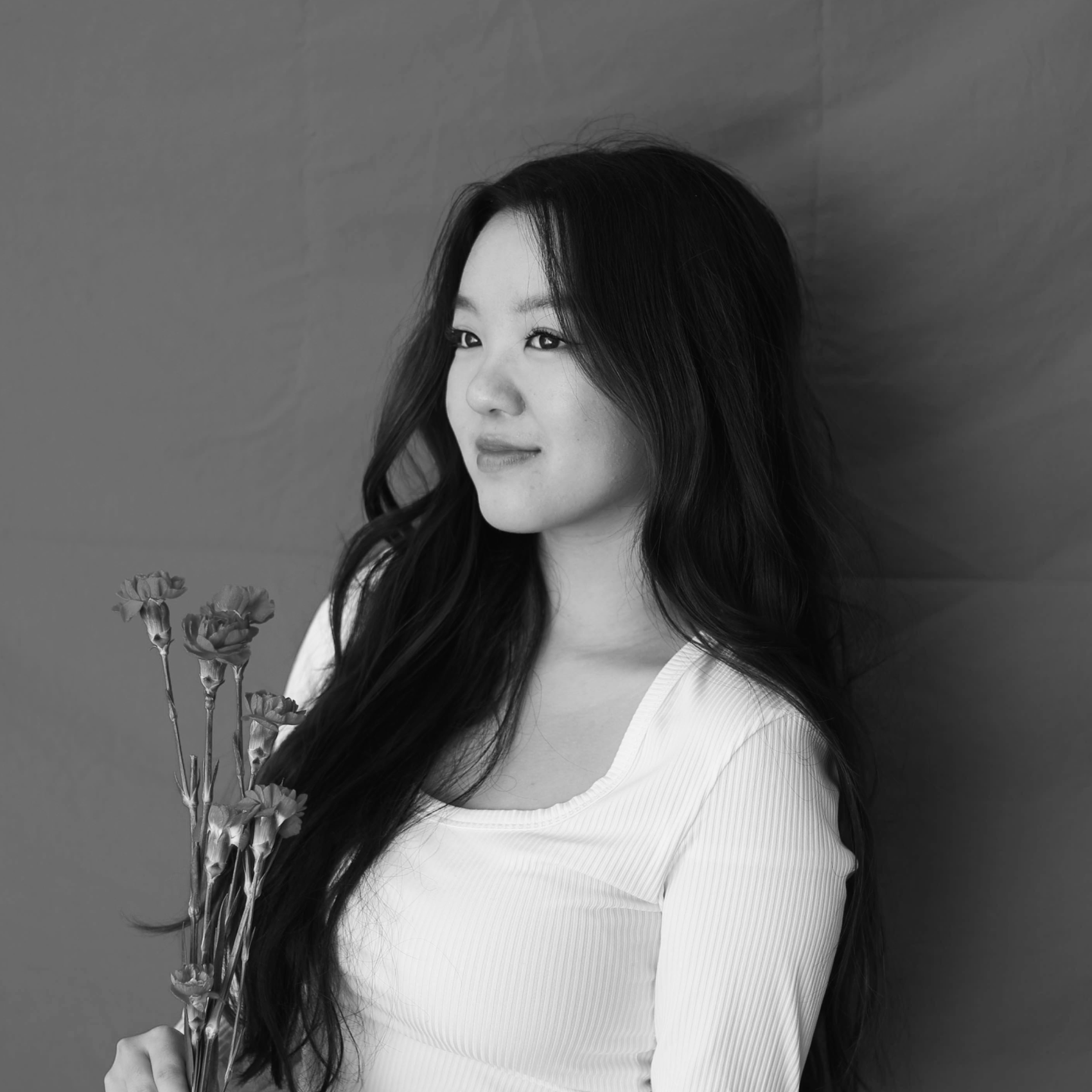
Katherine Wang
Katherine is a third year Psychology and Digital Humanities student at UCLA. Born and raised in Southern California, she has an interest in art, research, creative design, and her Chinese American heritage. For this project, Katherine took on a leadership role and oversaw the task delegations and deadlines in regards to the project. She was additionally a Web Designer and spearheaded accessibility, visual design, and web layout alongside Grace Xiao.

Amy Xin
Amy is a third Year Psychology Major with a specialization in Computing, and two minors in Digital Humanities and Public Health. As the Project Manager, she oversaw the planning and execution of the project along the rest of the team by ensuring schedules were communicated and milestones were hit. Additionally, she was born and raised in Southern California, with a passion for culture, art, literature, and willingness to learn.
Grace(Yaxuan) Xiao
Grace is a third year, majoring in Cognitive Science with a computing specialization and a Digital Humanities minor. Born and raised in China, Grace moved to Southern California when she was 12 years old, where the diverse culture and rich art scenes nurtured her passion for human relations, art, design, and culture. Grace was in charge of Web Design alongside Katherine and additionally edited our project by ensuring completeness, consistency, reliability, and accessibility of the project.
Chloee Carlson
Chloee is a third year Communications major with a minor in digital humanities. She has lived in Orange County her entire life and loves everything about Southern California. Working with people is definitely a strong quality of hers and she put her collaboration skills to the test by serving as the Content Developer in this project. She specifically helped to develop a consistent narrative across all fronts as well as maintain a clean overall aesthetic.

Andrew Arteaga
Andrew is a fourth year Statistics and Data Science Major at UCLA. As the project’s Data Specialist, he helped give initial general impressions of the data and uncovered statistically relevant information about the data. Andrew grew up in the San Fernando Valley, where his quiet upbringing fueled his current interest in thrill-inducing activities, such as riding motorcycles and drifting cars.

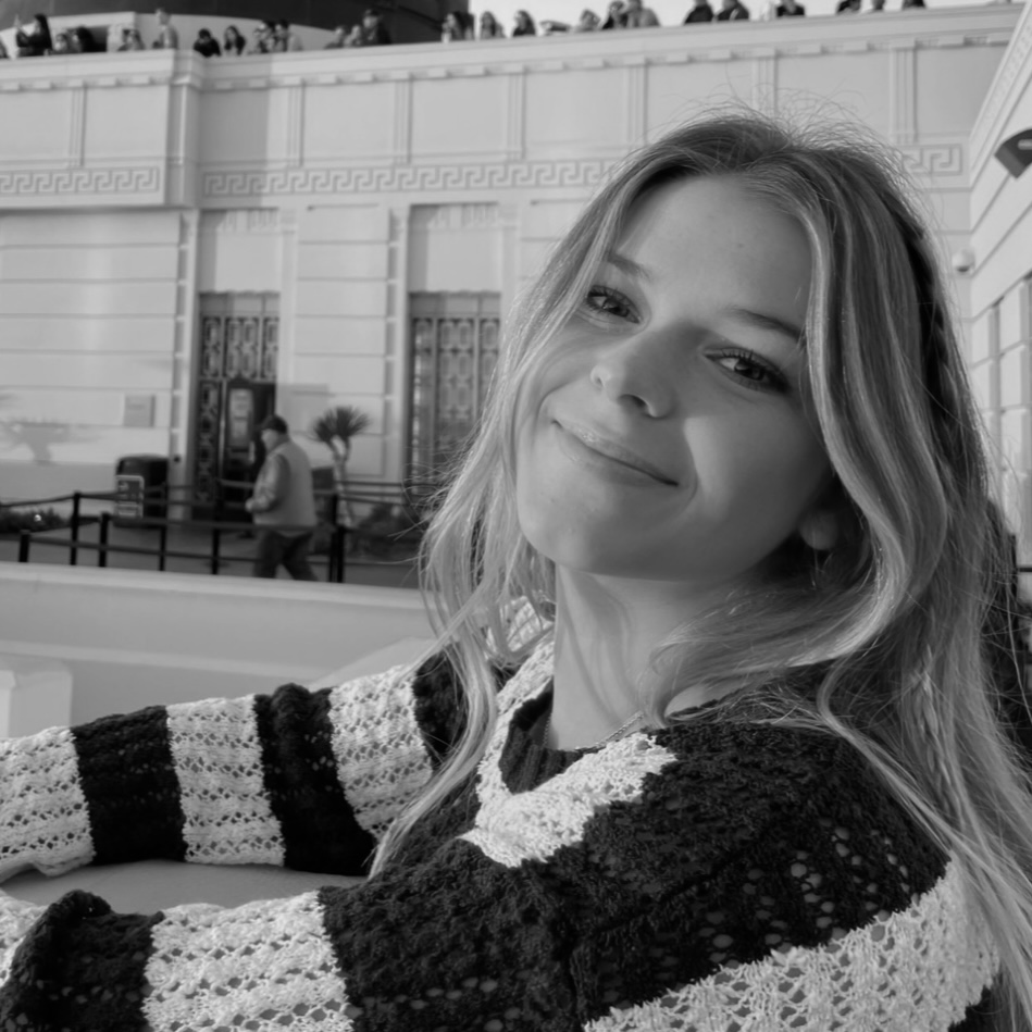
Shery Lauron
Shery is a third year Cognitive Science Major with a specialization in Computing. Originally from Northern California, she immersed herself in the dynamic cultural scene of San Francisco. Surrounded by the city’s rich diversity and artistic vibrancy, she developed a deep appreciation for creative design. In her role as the Data Visualization Specialist, she defined the overarching strategy for visualizing data, establishing standards for visual design, and ensuring that all visualizations remained aligned with the project’s objectives.
Acknowledgements ✨
Ashley Sanders
Thank you for sharing your knowledge and passion for statistics, visualizations, power, narratives, and silence. Thank you for this course and for introducing us to resources and super interesting lectures!
Nicholas Schwieterman
Thank you for your unwavering guidance on our project as we struggled through our data visualizations and directionality. Your patience and kindness helped us immensely!